Tootfinder

Opt-in global Mastodon full text search. Join the index!

@Techmeme@techhub.social
2025-11-11 21:15:53

Threads adds new features for podcasters, as it tries to become the de facto place for people to talk about shows and engage with creators (Sarah Perez/TechCrunch)
techcrunch.com/2025/11/11/thre

@Mediagazer@mstdn.social
2025-10-20 01:01:09

X is testing a new way of opening links without fully covering an X post, allowing users to see the Like, Repost, and other buttons, starting on iOS (Cheyenne MacDonald/Engadget)
engadget.com/x-is-testing-a-ne

@blakes7bot@mas.torpidity.net
2026-01-04 13:22:50

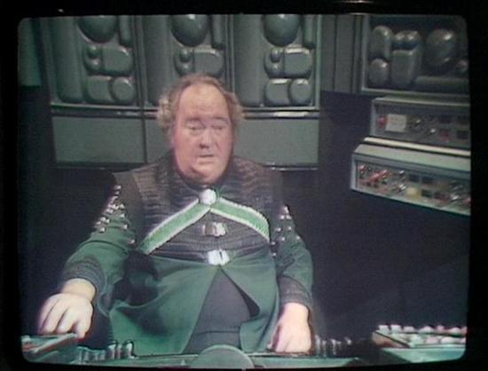
Series D, Episode 08 - Games
GAMBIT: Yes, Belkov.
BELKOV: [O.M.S.] Position please.
GAMBIT: Your orbit is stable, you are approaching optimum departure co-ordinates.
BELKOV: [O.M.S.] Fine. Sever guidance links, give me automatic control.
blake.torpidity.net/m/408/503

Claude Sonnet 4 describes the image as: "This image shows a scene from what appears to be a science fiction television production, likely from the 1970s or 1980s based on the visual style and film quality. The setting is clearly a futuristic spacecraft or space station, with characteristic sci-fi interior design elements including control panels, screens, and technological equipment visible in the background. The lighting and set design have that distinctive retro-futuristic aesthetic common to…
@Techmeme@techhub.social
2025-10-19 22:01:39

X is testing a new way of opening links without fully covering an X post, allowing users to see the Like, Repost, and other buttons, starting on iOS (Cheyenne MacDonald/Engadget)
engadget.com/x-is-testing-a-ne

@andres4ny@social.ridetrans.it
2025-11-15 23:16:11

Phanpy doesn't support quoots yet, so I'm using Mastodon's stock web interface and.. it's bad. Compare how busy it looks with unnecessary stuff (do I really need a "post" input form on screen at all times? Do I need a link to "favorites" visible at all times?), but also - the fonts are bad. Bad, bad, bad. Just so much harder to read. And the timeline toots just kind of run together, rather than being clearly delineated by whitespace in phanpy.

Phanpy interface, showing a single column with clearly delineated toots. Up top there's a hamburger icon (that gets you links to everything else), a bell icon (for notifications), and on the bottom right hand side of the screen a little ink quill icon for posting. And the font text is bigger/clearer.
Mastodon's official UI home screen. There are three columns taking up the whole screen. Left column has half taken up with an input form for posting a new toot. Then there's some wasted space, and at the bottom a bunch of text links: "social.ridetrans.it: [About] [Profiles directory] [privacy policy]", etc.

The middle column has all the toots from my timeline. There is only a single thin grey line separating the toots, and the text is small and somewhat difficult to read.

The right column…
@blakes7bot@mas.torpidity.net
2025-11-15 22:17:30

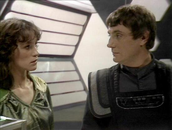
Series A, Episode 05 - The Web
CALLY: [Moves to stand next to him] Why?
AVON: All knowledge is valuable.
CALLY: [Touches her temple as if listening] Which are the forward detector links?
blake.torpidity.net/m/105/40 B7B6

Claude 3.7 describes the image as: "This image appears to be from the classic British science fiction television series "Blake's 7." The scene shows two people in a futuristic spacecraft setting, with distinctive angular wall panels visible in the background that were characteristic of the show's set design.

The person on the left is wearing a greenish metallic top, while the person on the right is dressed in a dark outfit with a structured vest or armor piece that has padded shoulders and a p…