@crell@phpc.social
2026-10-23 13:46:39
@crell@phpc.social @ErikJonker@mastodon.social
I think the Mastodon developers have good intentions, but they failed in my view with the new User Interface, it's much worse then the old one, multi-column view, I switched to phanpy.social for that.
#mastodon #ui #multicolumn #phanpy
 @pgcd@mastodon.online
Please, please #mastodon web developers: find a way of allowing me to keep the page open without it turning into a multigigabyte monster.
Please.
 @jorgecandeias@mastodon.social
@… Why?
If there's 1 new item, obviously there's 1 unread. Why are you wasting precious space with redundant information?
#mastodon #mastodonfeedback

 @Ruhrnalist@mastodon.social
To whom it may concern:
This sucks!
#Mastodon5

 @rasos@fairmove.net
Successfully upgraded @… 's fairmove.net #mastodon instance to version 4.7.2. It now supports link objects in attachments. This time the update was more tricky as we already had to prepare for the upcoming version 5. I needed to deploy an extra pre and post database…
 @AimeeMaroux@mastodon.social
I don't know what the objective was behind the changes in Mastodon's design but I don't think it is a good idea to hide so much behind icons when one of the most common criticisms of #Mastodon is that it is hard to use. I use it on desktop, maybe it's optimised for mobile, but I liked that everything was easily accessible on two sides of the feed. Also the "new post" window opening in front of the feed instead of being always on is annoying as fuck.
 @cheeaun@mastodon.social
Why zero? Why bold? 🤔
#Mastodon5DesignFeedback

 @_tillwe_@mastodon.social
Ich merke: ich mag Designänderungen nicht. Egal wie durchdacht sie sind. Und ja, vermutlich habe ich mich in ein paar Tagen dran gewöhnt, aber grade bin ich nur genervt davon, dass alle Bedienelemente bei Mastodon 5.0 jetzt anders wo liegen, die Schriften anders sind, usw. ... #mastodon5.0
 @cybertailor@craba.cab
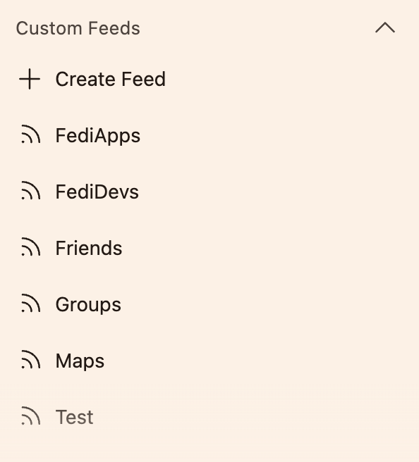
Решила я прочекать Crowdin, что там нового в переводах #Mastodon, а там меня встречает вот такое:
> Custom feeds were formerly known as "Lists"
Я склоняюсь к тому, чтобы не переименовывать списки и оставить всё как было. Но вдруг новый вариант нравится вам больше?
@…
 @funkvolk@mastodon.social
Ich bin jetzt übrigens "Warum eine neue Oberfläche, die alte war doch noch gut, das haben wir ja noch nie so gemacht"-Jahre alt. #MastodonNeu
@jorgecandeias@mastodon.social@… The unread thing, in fact, is completely useless. A waste of space. And wrong. A while ago, I had it at 0 unread (why do I need this on my screen?!) while having some 4 or 5 posts with the blue line immediately below. #mastodonfeedback #mastodon
@cheeaun@mastodon.socialAlmost feel like I found an easter egg.
#Mastodon5DesignFeedback
@jorgecandeias@mastodon.social@… OK, and this is just weird.
#mastodonfeedback #mastodon
 @cheeaun@mastodon.social
Reminds me of RSS feeds. Probably a good thing 🤔
#Mastodon5DesignFeedback
 @jorgecandeias@mastodon.social
 @darkrat@chaosfurs.social
The web in 2027
#mastodon #mastodon5 #firefox #ux
 @jorgecandeias@mastodon.social
@… And this is really, REALLY bad.
Before, you could know at a glance what was being boosted, liked, whatever. Now it's this nonsense. Come on. This is just stupid. Please revert.
#mastodonfeedback #mastodon
 @cheeaun@mastodon.social
Good to spend some time reading #Mastodon5DesignFeedback here https://community.joinmastodon.org
@jorgecandeias@mastodon.social@… Also, the translate button is obnoxious. Especially as I don't need translating in the vast majority of places it appears at.
We need either a much smaller button, that doesn't take away too much space from actual content, or a list of languages, in the settings, for which the button should not appear at all.
#mastodonfeedback #mastodon
 @insl@tooting.ch