2026-04-15 01:36:45
#TIL tittles in “i” and “j” doesn’t have to have the same shape as period.
#typography
#TIL tittles in “i” and “j” doesn’t have to have the same shape as period.
#typography
 @publicvoit@graz.social
This is really an interesting story of the history behind #loremipsum as a standard filler text in #typography.
And it reveals many wrong assumptions and fixes historic errors. No, it's not just #latin
 @tschfflr@fediscience.org
RE: #typography crowd?
 @sherold@mastodon.online
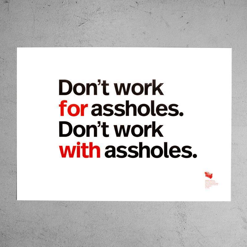
Erik Spiekermann was right, of course.
#typography #design #graphicdesign #quotes